WORKDESIGN PROCESSABOUTRESUME
INTRODUCTION
ValueGlance is a San Francisco–based fintech startup focused on making investing approachable and habit-driven. It helps beginner and long-term investors discover high-quality & deep-value stocks for sustainable growth, beyond short-term hype.
CORE RESPONSIBILITIES
IMPACT
• Conduct and plan surveys and usability interviews
• Iterate designs through regular design reviews
• Deliver mid- and high-fidelity prototypes
• Document screen flows and components
•  +28%  first-time screener completion (emerging investors)
•  −15pp  drop-off rate on the screener panel (47% → 32%)
•  +24%  watchlist additions from the screener
TEAM
ROLE
TOOLS
• CEO / Back-end Engineer - Fiona Wang
• Front-end Engineer - Ayushman
• Financial Analyst - John Dodaro
• UX/UI Designers - Me & Hazel Tsai
UX / UI Designers
• Figma / Figjam
• Linear
• Notion
• Lovable
TIMELINE
Oct ’25 - Jan’26 (3 months)
PROJECT  OVERVIEW
CONTEXT
When I took over the product,
Stock screener has strong potential to meet users’ investing needs.
However, users struggle to effectively use it due to high cognitive load and unclear interactions, limiting confident stock discovery.
To kick off,  here is what we need to know.
* Research Findings
Eventually, there was a gap between users’ investment goals and how the interface supported them in taking action.
PROBLEM
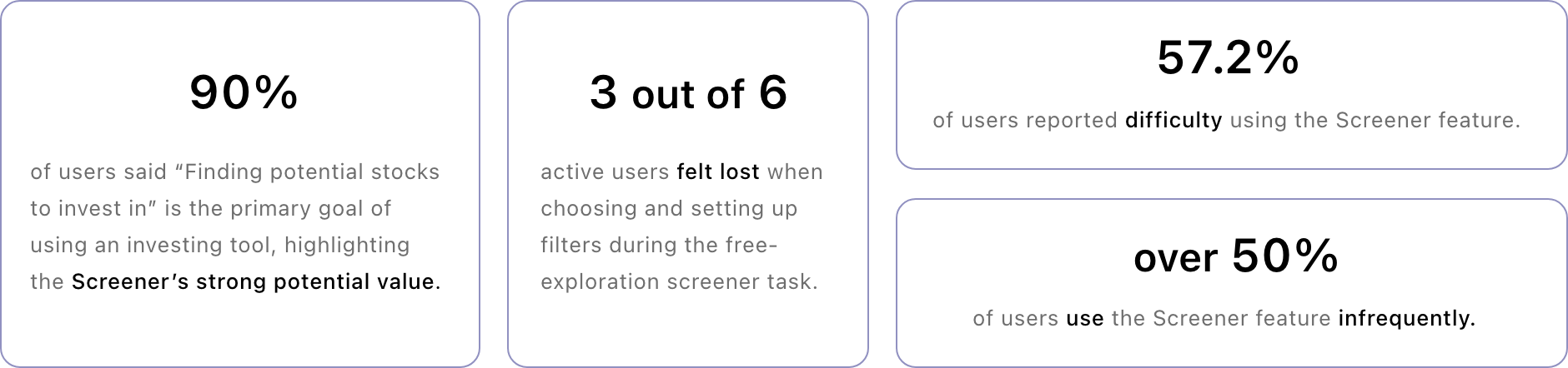
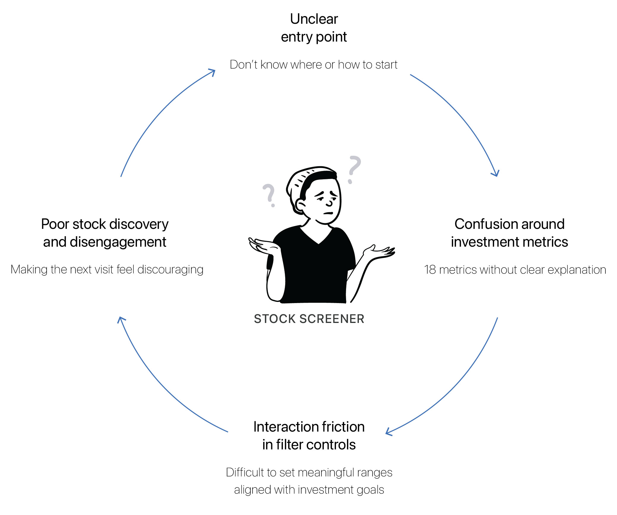
01.  Users struggle to choose the right screeners and filters, and to connect VG’s guided
        strategies with their own investment goals.
02.  Extreme outliers squeeze usable slider range, and dynamic scaling breaks consistent
         context, making the interaction feel unstable.
* Negative Experience Cycle in Stock Screener
REFRAMING  PROBLEM
HMW redesign a data-heavy stock screener to
support confident discovery of high-quality, deep-value stocks
so that users can make goal-aligned investment decisions.
DESIGN OPPORTUNITIES
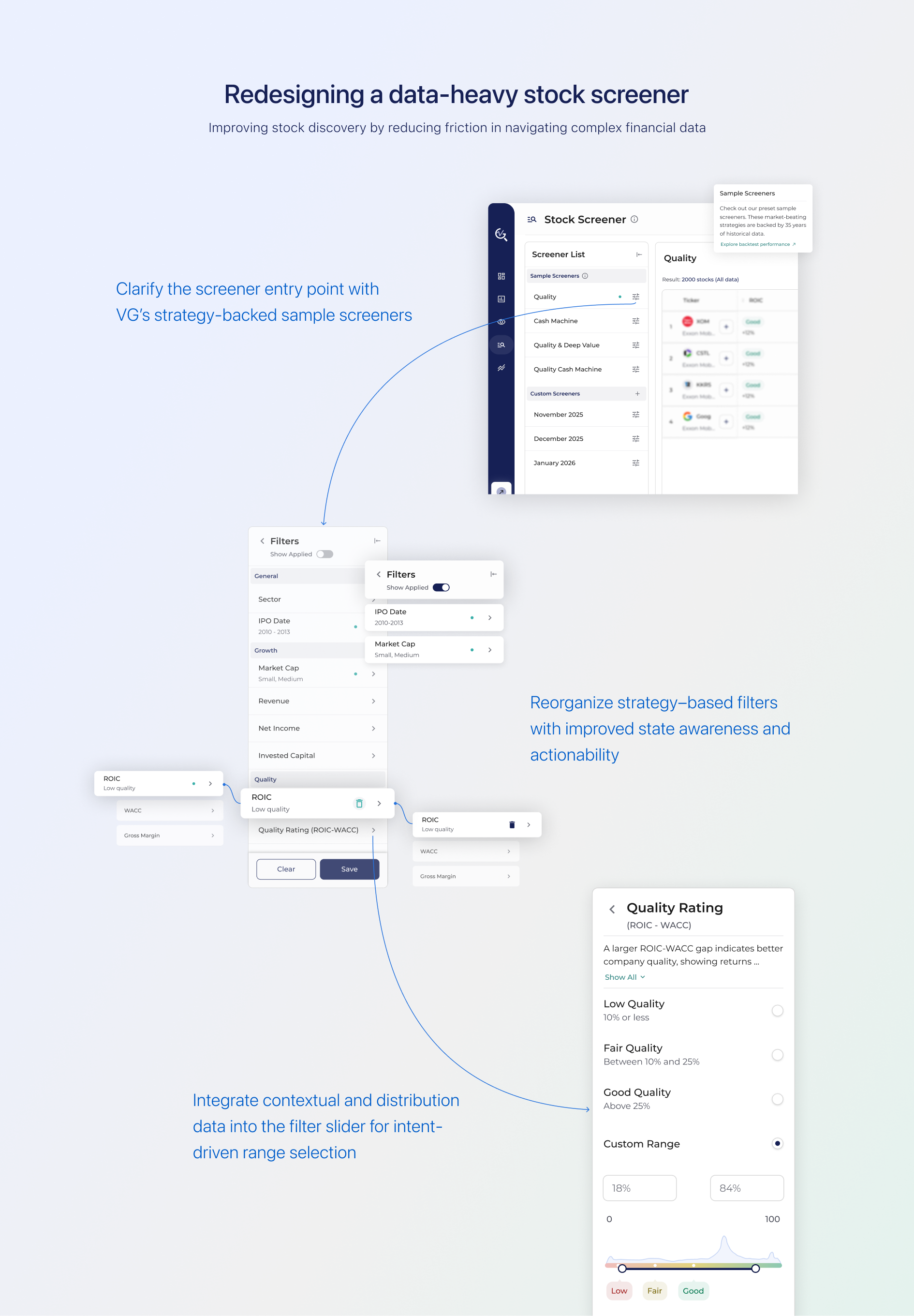
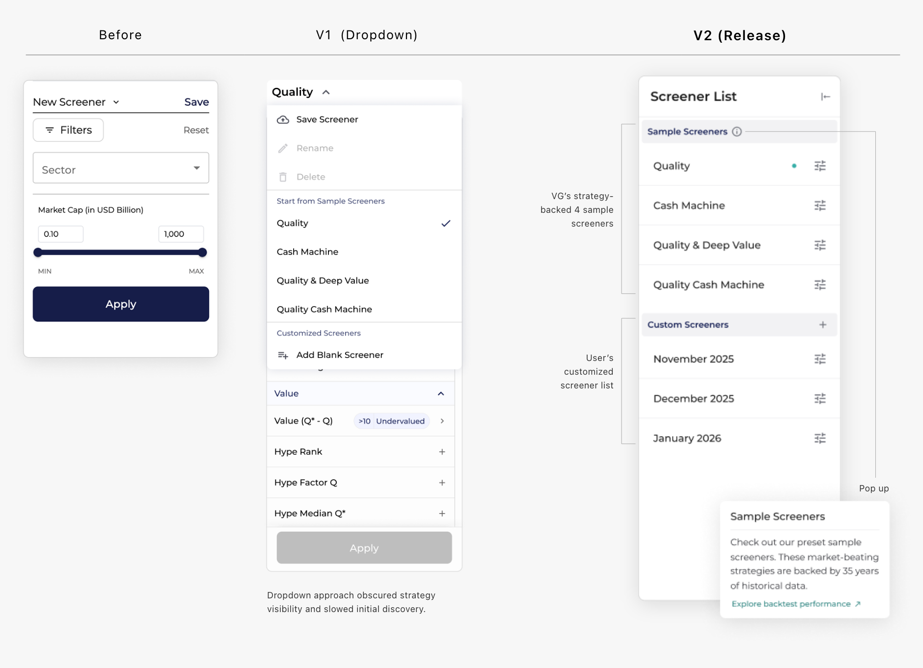
01.  Bridge VG's strategy-backed sample screeners to ease starting points.
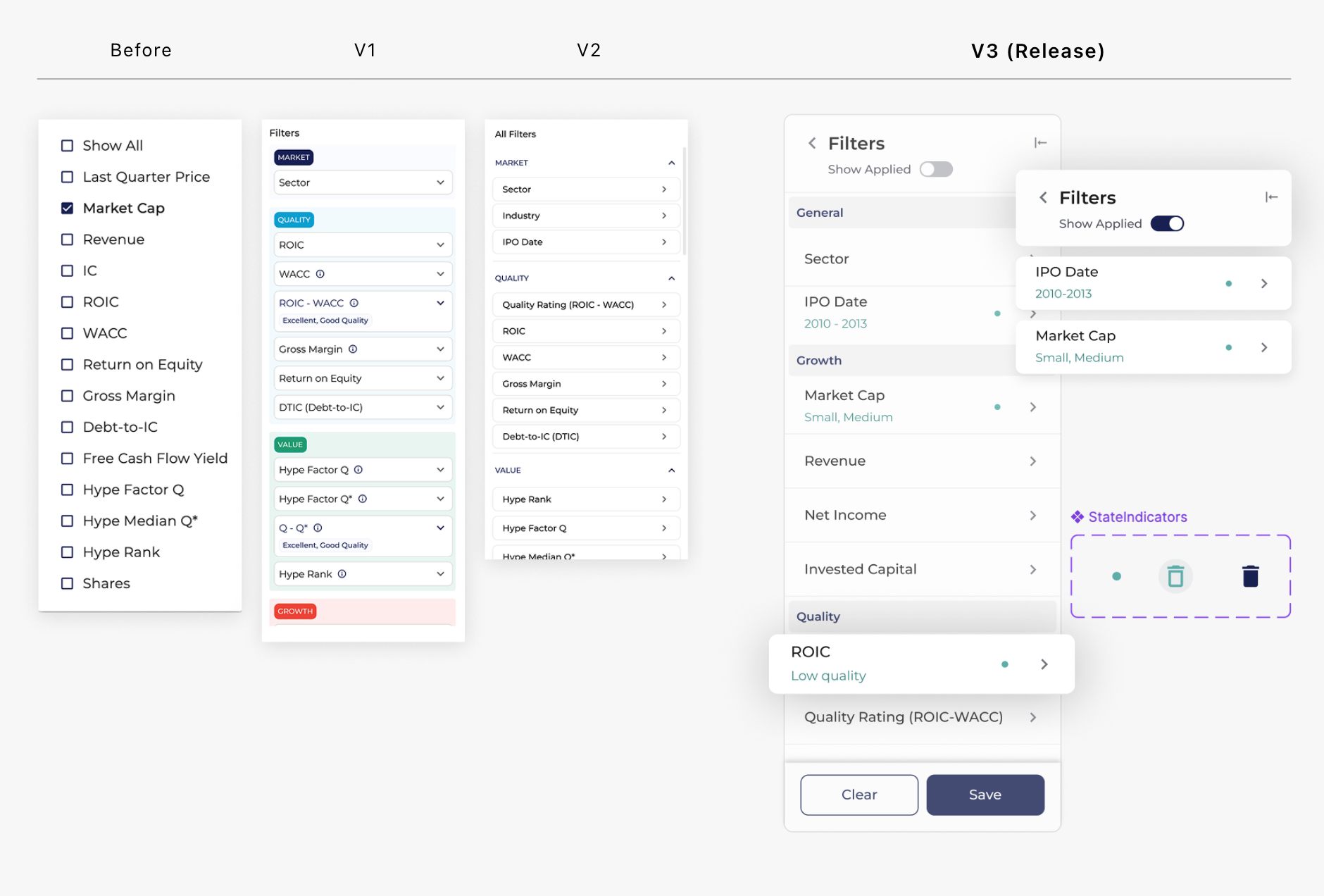
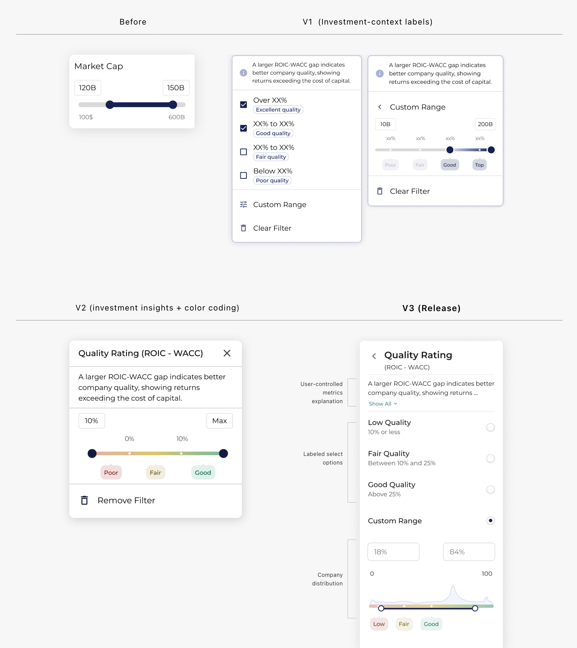
02.  Reorganize filters around users’ investing goals and support filter adjustments quick
        and actionable.
03.  Make filter interactions intuitive and intent-aware.
DESIGN  SOLUTION
IMPROVEMENT 01
Clarified a strategy-first entry point
Surfaced strategy-backed sample screeners and clearly distinguish them from custom screeners, helping users start discovery with clear direction.
IMPROVEMENT 02
Reorganized strategy-based filters around user intent with clear state cues
Reframed filters within a strategy-based structure (Growth/ Quality/Value) supported by clear state cues, so users quickly make intentional adjustments.
IMPROVEMENT 03
Enhanced slider interactions with context and distribution
Integrated contextual insights and data distribution directly into slider controls, enabling users to set ranges intuitively and make more informed decisions.
REFLECTION
  • Working closely with PMs and engineers helped me better understand technical constraints early on.
  • Feedback from teammates shaped how I refined interactions and prioritized improvements.
  • Collaboration helped me think beyond individual screens and consider system-level behavior.
Sunmin Ko
Winston-Salem, NC, USA
smk10ux@gmail.com
© 2023 by Sunmin Ko Proudly created with Webflow.com